Customize Form CSS
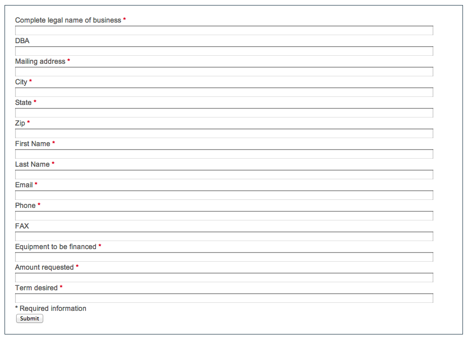
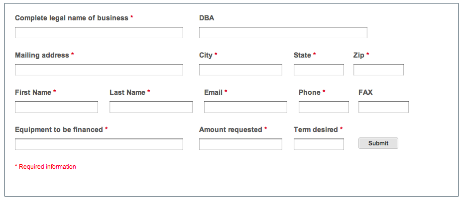
Purlem gives you full control of the HTML so you can modify a form design directly through the CSS. Below is a before and after screenshot of a form completed for a client:
Before
After
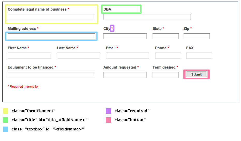
Each form has the follow CSS fields that can be modified:
- class=”formElement”
- class=”title” id=”title_<fieldName>”
- class=”textbox” id=”<fieldName>”
- class=”required”
- class=”button”
.formElement {
float:left;
width:350px;
margin-right:20px;
margin-bottom:23px;
}
.formElement:nth-child(3), .formElement:nth-child(4) {
width:200px;
}
.formElement:nth-child(6), .formElement:nth-child(7), .formElement:nth-child(11), .formElement:nth-child(12){
width:100px;
}
.formElement:nth-child(5), .formElement:nth-child(8), .formElement:nth-child(9), .formElement:nth-child(10), .formElement:nth-child(14) {
width:170px;
}
.formElement:nth-child(15) {
width:120px;
}
.formElement .title {
font-weight:bold;
margin-bottom:7px;
height:20px;
}
.formElement .textbox {
font-size:14px;
}
.formElement:nth-child(16) .title {
color:red;
font-weight:normal;
font-size:12px;
}
.button {
float:right;
margin-top:-50px;
margin-right:100px;
background: #e3e3e3;
border: 1px solid #bbb;
-webkit-border-radius: 3px;
-moz-border-radius: 3px;
border-radius: 3px;
-webkit-box-shadow: inset 0 0 1px 1px #f6f6f6;
-moz-box-shadow: inset 0 0 1px 1px #f6f6f6;
box-shadow: inset 0 0 1px 1px #f6f6f6;
color: #333;
font: bold 12px "helvetica neue", helvetica, arial, sans-serif;
line-height: 1;
padding: 4px 0 5px;
text-align: center;
text-shadow: 0 1px 0 #fff;
width: 80px; }
button.minimal:hover {
background: #d9d9d9;
-webkit-box-shadow: inset 0 0 1px 1px #eaeaea;
-moz-box-shadow: inset 0 0 1px 1px #eaeaea;
box-shadow: inset 0 0 1px 1px #eaeaea;
color: #222;
cursor: pointer; }
button.minimal:active {
background: #d0d0d0;
-webkit-box-shadow: inset 0 0 1px 1px #e3e3e3;
-moz-box-shadow: inset 0 0 1px 1px #e3e3e3;
box-shadow: inset 0 0 1px 1px #e3e3e3;
color: #000;
}
Notice how the CSS's :nth-child() Selector was used. This is a great way to identify a specific formElement that you want to apply CSS to. In this case it allowed us to give each formElement a unique width.
Also, for some creative CSS buttons, check out Chad Mazzola's CSS3 Buttons.